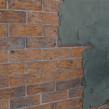
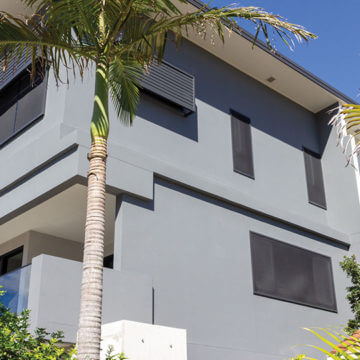
When choosing the colour for your render, there are many important things to consider. Here at Render Systems Australia, we have a curated range of colours available which can be viewed online or from our true-to-life colour card. There are multiple variables that influence the way a colour is displayed on a screen, so we recommend you only choose colours from a sample or colour card. We have broken down the reasons below.
Colour appearance on screen vs. paper
Whether you are using a monitor, computer, phone or tablet, every screen has a unique colour profile. Each device will display the colour slightly differently, making it impossible to know if your screen accurately matches the original swatch. Each device displays colour slightly differently with some screens presenting colours with a cool tone and others with a warm tone. The brightness of a screen also influences the way colour is presented.
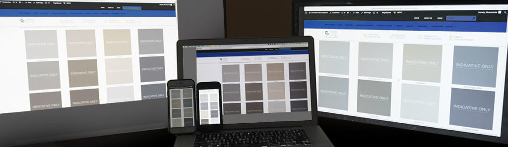
As you can see below, the same page is open across a variety of devices. When you look at the swatches, each one is slightly different in tone with some appearing warmer and others cooler or more dull.
For this reason, we only recommend choosing a colour from a true-to-life colour card or a physical sample. The colour swatches online should only be used as a guide. If you would like to view our colour range, we’d be happy to send you an accurate colour card so please contact us here.
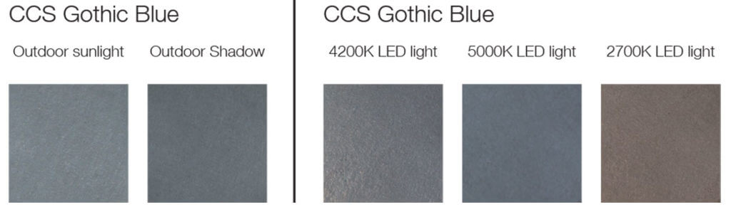
The effect of light
Different lighting will also affect the way that colours can be interpreted. Below is an example of how indoor lightings and natural lightings will display variations in the colour.

Printed Colours
To show the difference between screens and printing, let us do a quick exercise.
-
- Open a white document on your screens (computer and phone)
- Hold a blank piece of paper next to the screens
You may notice that your paper appears yellow and your screens show blue tones. This is a common result.This exercise aims to highlight the white point mismatch. Your screens produce white by setting it to a certain RGB (red, green, blue) number. The paper is dependent on the light illuminating it, though it is also influenced by its own characteristics as well, such as brand and finish.
Monitors can display a white that ranges from warm yellow-red tones through to cool blues.
Printers use a different breakdown of colour to produce an image than any screen. Most colours are reproduced using a combination of CMYK (cyan, magenta, yellow and black).
No matter how careful each print run is, every print run varies in the amount of ink, the pressure of the plate and the type of paper that is used. Additionally, the age of the printed piece will also affect colour reproduction as ink colour will fade over time. A printed colour card should only be used as a guide to show the variety of colours available, rather than an exact match.
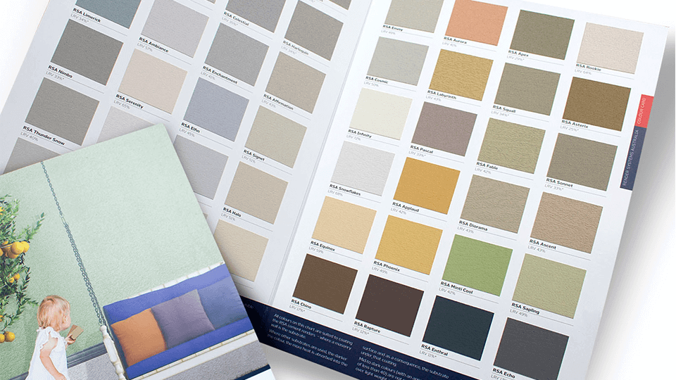
Physical Colour
When choosing a colour for your rendered area, we strongly recommend that you order a physical copy of our colour card. This colour card is far more accurate than other resources. This is because the colours on our colour cards are made from small swatches with genuine colour-match render brushed on to them.
Here at RSA, we are here to help you in any way we can. Please get in contact with us via email or by calling 1800 077 744 and we can send you a colour card that is a more accurate representation.